The website is currently under Q/A Testing and will be ready for beta release in February 2019.
About Project.
This project was a TecHKU initiative to promote entrepreunership on campus by connecting startups, researchers and student groups with the right talent on campus. The original idea was conceived by me in early 2017 and I started developing it from October 2017 onwards with the Developer Team at TecHKU.
My Role
I worked as a Product Manager throughout the Software Development Lifecycle. I designed the initial UX of the platform and worked alongside developers to build the first prototype for testing. I also worked with UI Designer Dominic Co to implement the visual design of the platform and refine the User experience after testing.
“ I wish this University allowed me to be enterprising and do my own thing, than be buried in books all-day.”
- student emotions during exam period
Needfinding
Pain Points
Current methods of collaboration for projects seem to be limited in scope and have several drawbacks.
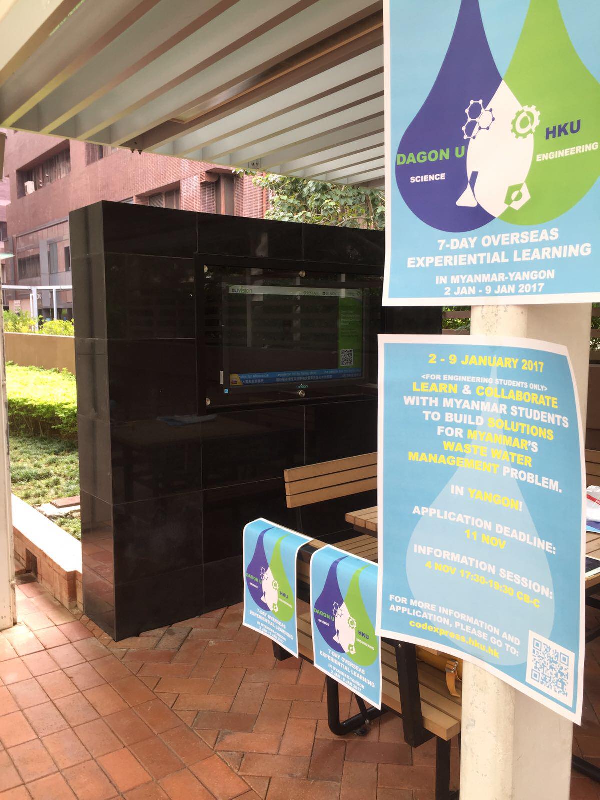
Booths
Students often setup booths on campus to attract talent and advertise their projects, however this approach is not targetted and there is no guarantee that they would reach the right crowd. Not to mention the effort and costs involved in setting up a booth on campus.
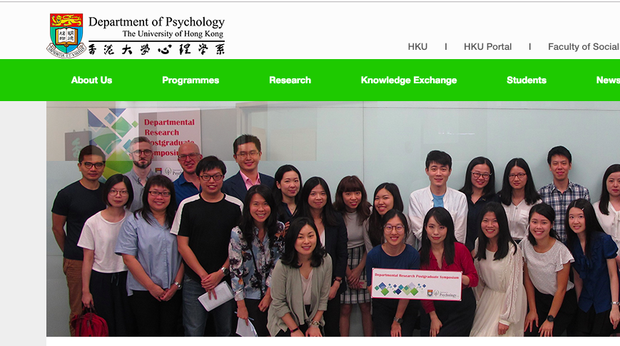
Websites
Most departments advertise research positions deep inside the faculty websites or on the professor's profiles. This makes the information unorganised and users have to go through a number of different links/websites to find projects that they would want to join.
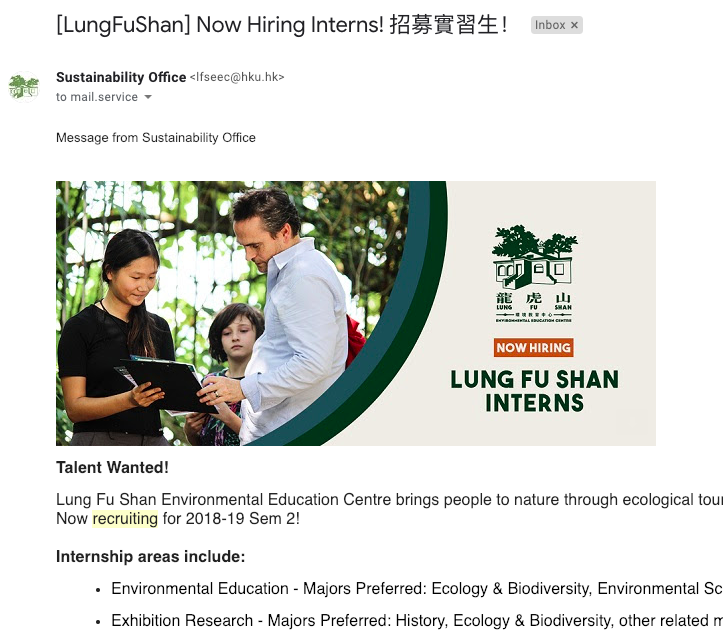
E-mails
Startups, Associations and Student groups often send out emails listing the roles they are hiring for. While this might be effective, the barrier to entry is quite high as getting mass email support is a lengthy process and requires partnerships with some University body that has access to the email system.

Word of Mouth
I have personally been approached many times by student groups looking for developers to work on projects with them. This method is ineffective because it depends heavily on how good the referral is and not the actual quality of the candidate.
User Types
After throrough research, four types of users were identified who would be interested in using a project collaboration platform to find talent.

Professors/Researchers
They need research interns and assistants for their projects.

Students
Student-initiated projects on campus can range from bookwriting to wearable ECG machines

Startups
Students are top-hires for any startup looking for talent with fresh ideas.

Associations
HKU has a number of societies that offer positions in their various departments.
Key User Questions
A. Looking for talent for projects - Project Owner
KUQA1. Who is the person?
KUQA2. What are his/her skills?
KUQA3. Why is he/she interested in the project?
B. Looking for projects to work on - Project Seeker
KUQB1. What are the projects avaliable for me?
KUQB2. What is the project about?
KUQB3. Who are the project owners?
KUQB4. What are the roles available?
KUQB5. What are the skills needed?
Iteration 1
Element
Design
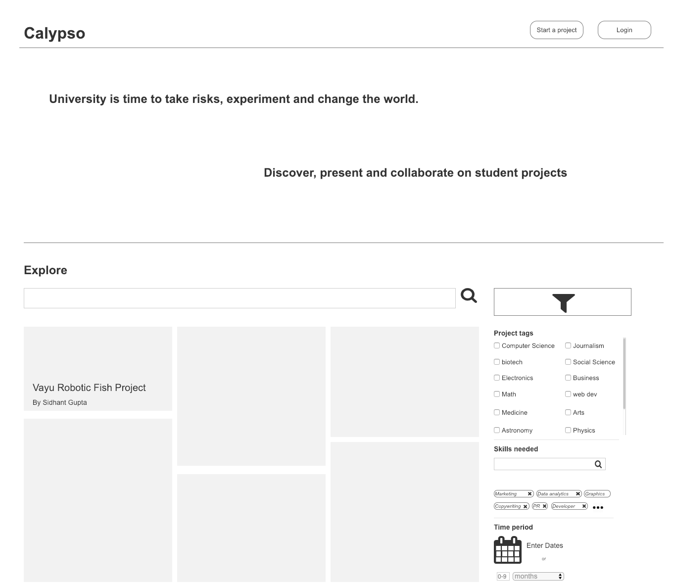
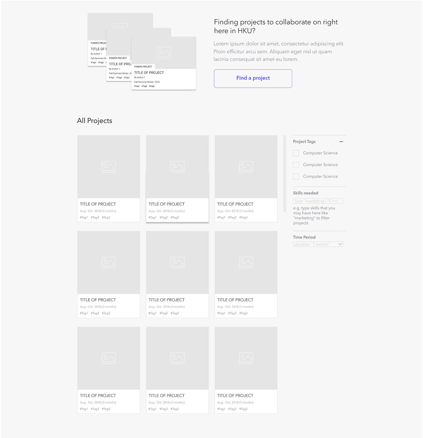
Project Seeker can browse different projects on Calypso in the explore page while Project Owner can start a project by clicking on Start Project . The projects can be filtered by project tags which describe the type of project and by skills the project owners are looking for. The user can also filter by time period of projects.
Addresses KUQB1


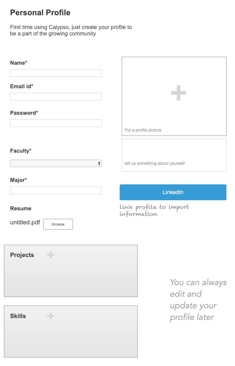
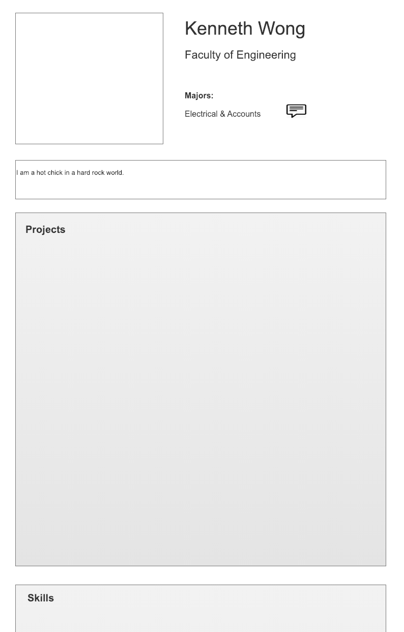
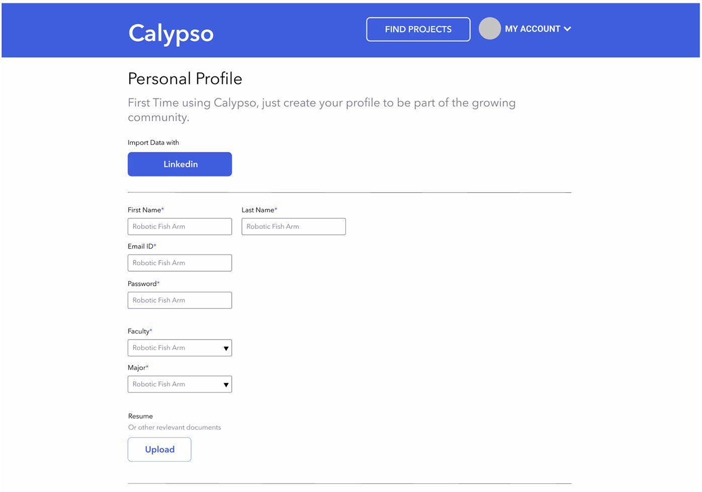
Both Owners and Seekers make profiles with their details on projects they've done and skills they have. Information can be imported from LinkedIn for a quicker userflow.
Addresses KUQB3, KUQA1, KUQA2, KUQA3

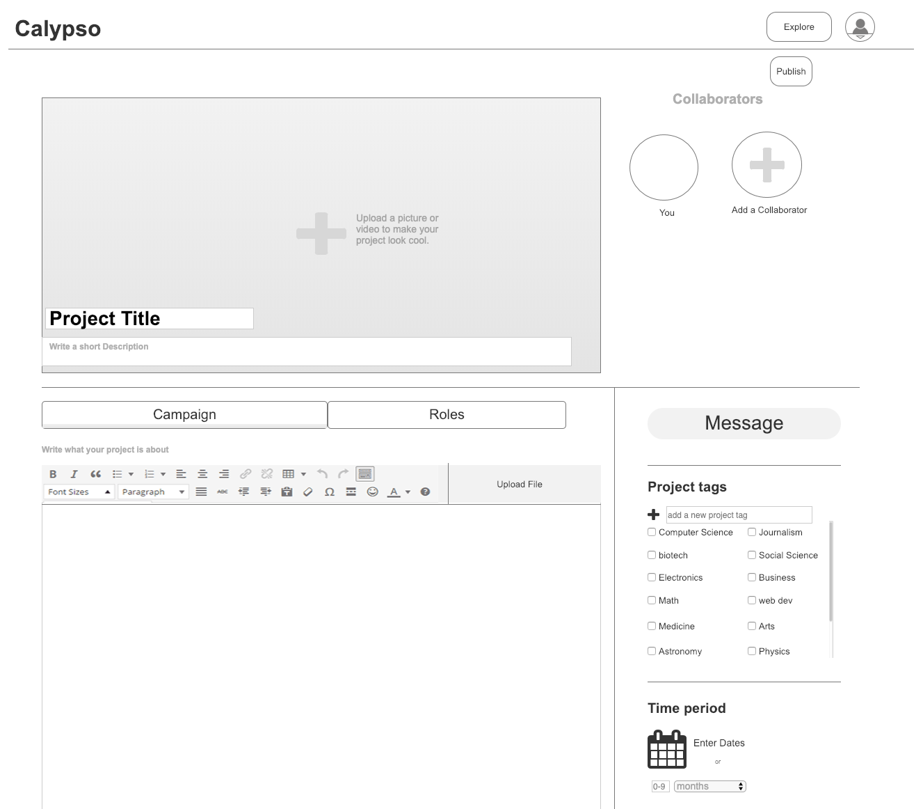
Project Owner can put in a description of what the project is about in campaign , put in the roles they are looking for and add collaborators on the project. The user can add tags on the right for the project to be easily identifiable along with time frame.
Addresses KUQB1, KUQB2, KUQB3, KUQB4, KUQB5

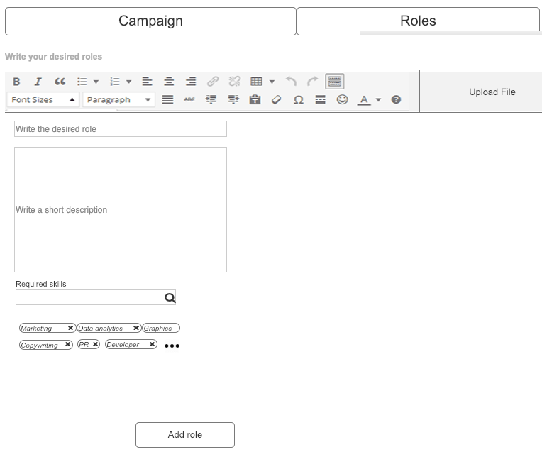
Project Owner can add specific roles he's looking for in the project with the role title, description and tags for skills required for the role.
Addresses KUQB4, KUQB5

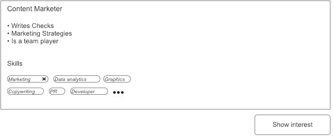
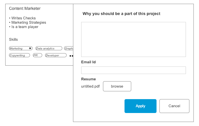
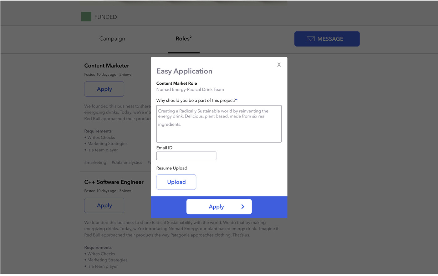
Project Seeker can look at the role available and its requirements and when he/she clicks on show interest an application form pops up wherein he fills in reasons for applying, email id and resume.
Addresses KUQA1, KUQA2, KUQA3

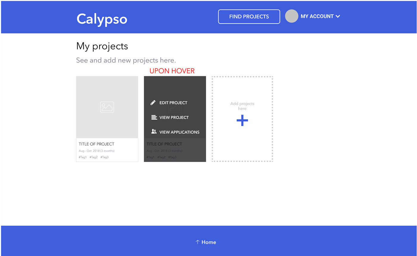
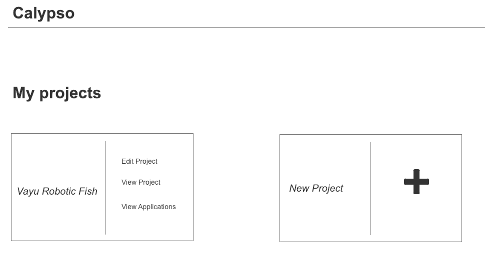
Project Owner can look at the list of projects that he has created on the website and has the option to edit it, view applications or create a new one.
Addresses KUQB1

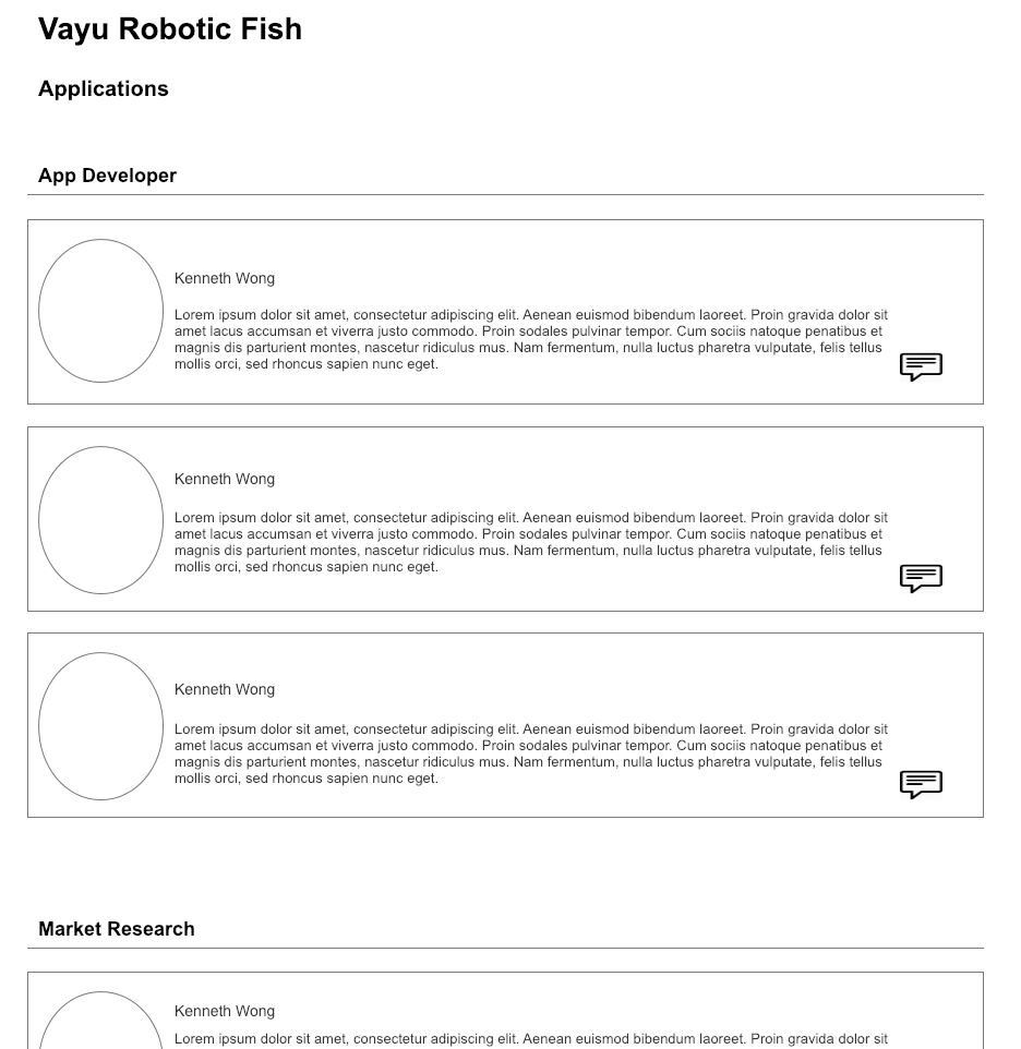
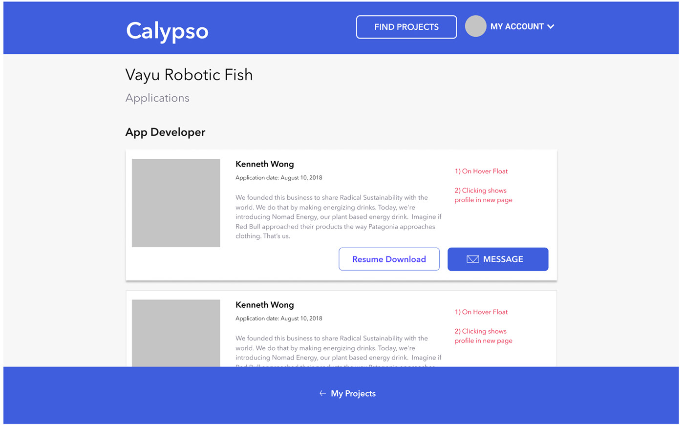
Project Owner can see the list of applciations for a specific role with the reasons for their interest, CV and a quick view of their profiles.
Addresses KUQA1, KUQA2, KUQA3

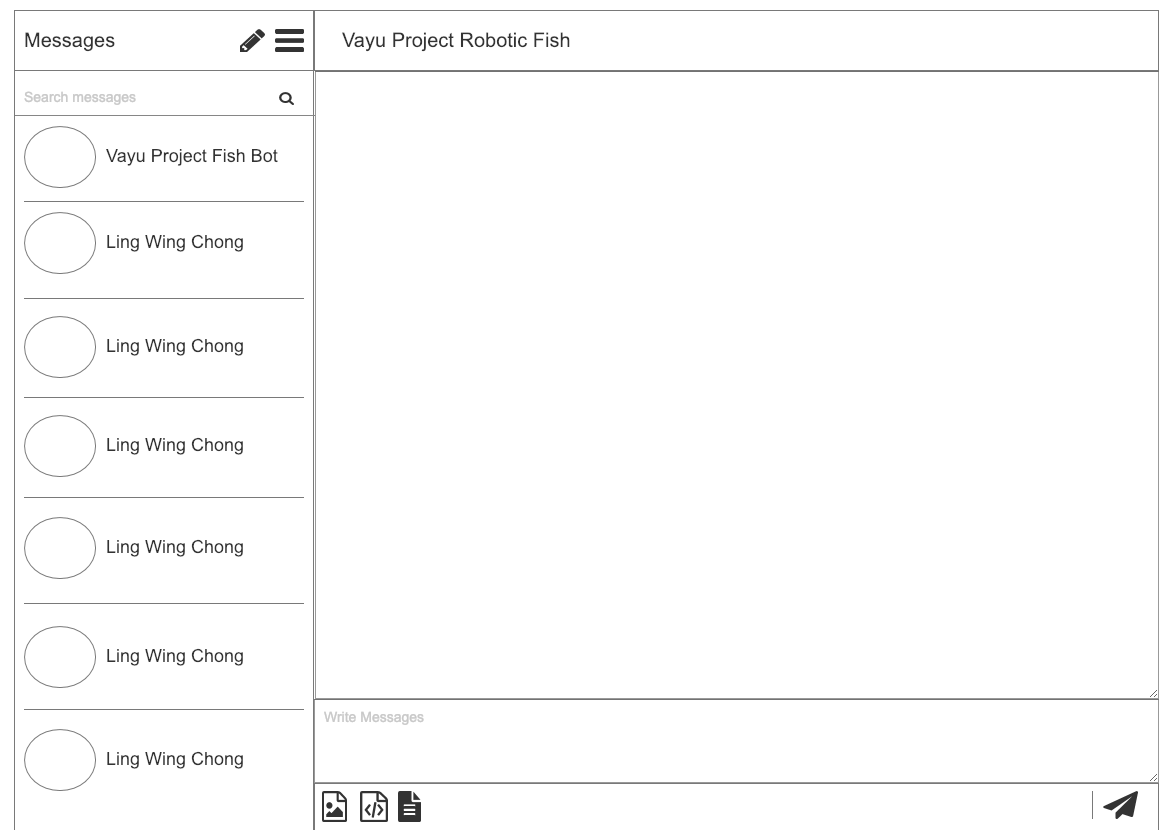
A messaging feature allows Project Owners and Seekers to talk further on the scope of the project or any questions they might have.
Addresses KUQB2, KUQB3, KUQA1
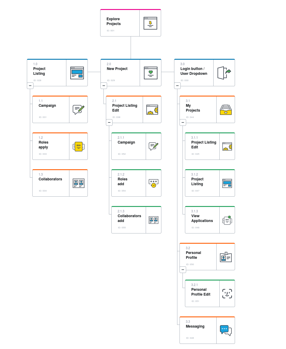
Sitemap
User Scenarios
Apply for a Project Role - Project Seeker
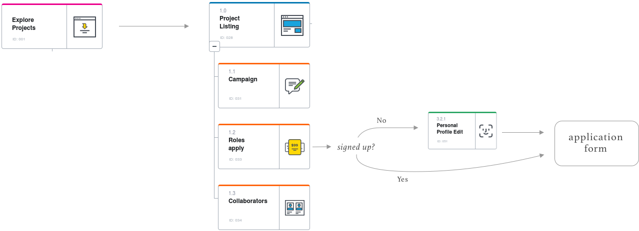
Post a Project - Project Owner

Interact with the Wireframe built in Axure
UX Audit and Usability Tests
Not enough copywrite to understand what the platform does.
No Call-to-action buttons to direct the user to perform desired actions.
Too much effort and information needed in Sign-Up Screen
Messaging feature unnecessry and cumbersome, doesn't appeal to users.
Designs not optimized for Mobile and Tablet viewing.
Designs
Messaging feature was replaced with an email feature to engage users in a better manner. Several design changes in accordance to the observations were made.
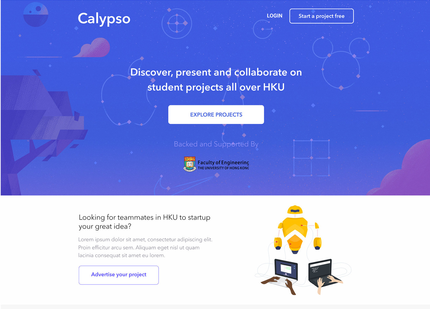
homepage
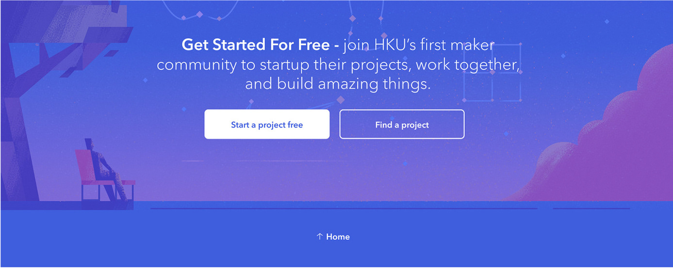
Several Copywriting elements were placed along with Call to Action Buttons for people to start interacting with the website.
top
bottom
middle
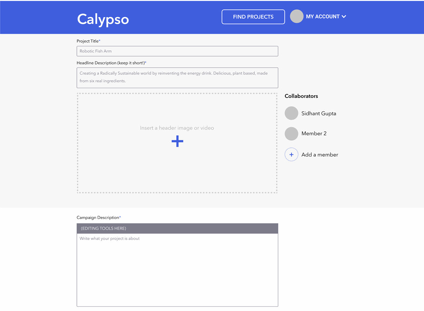
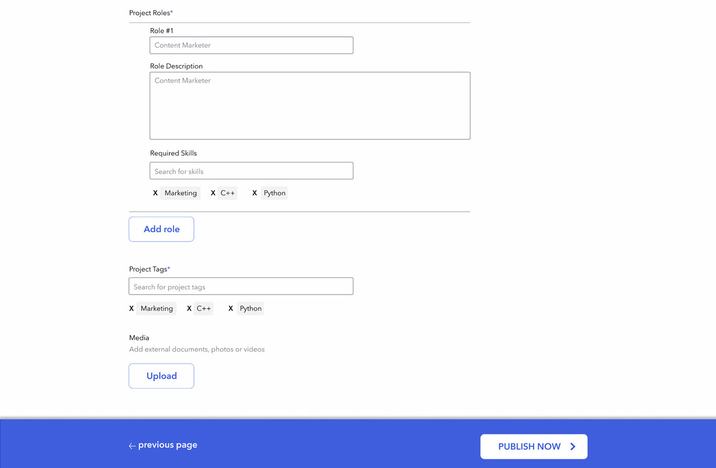
Project Edit
Edit page was redesigned to feel more like a continuous form that the user can fill quickly and edit later.
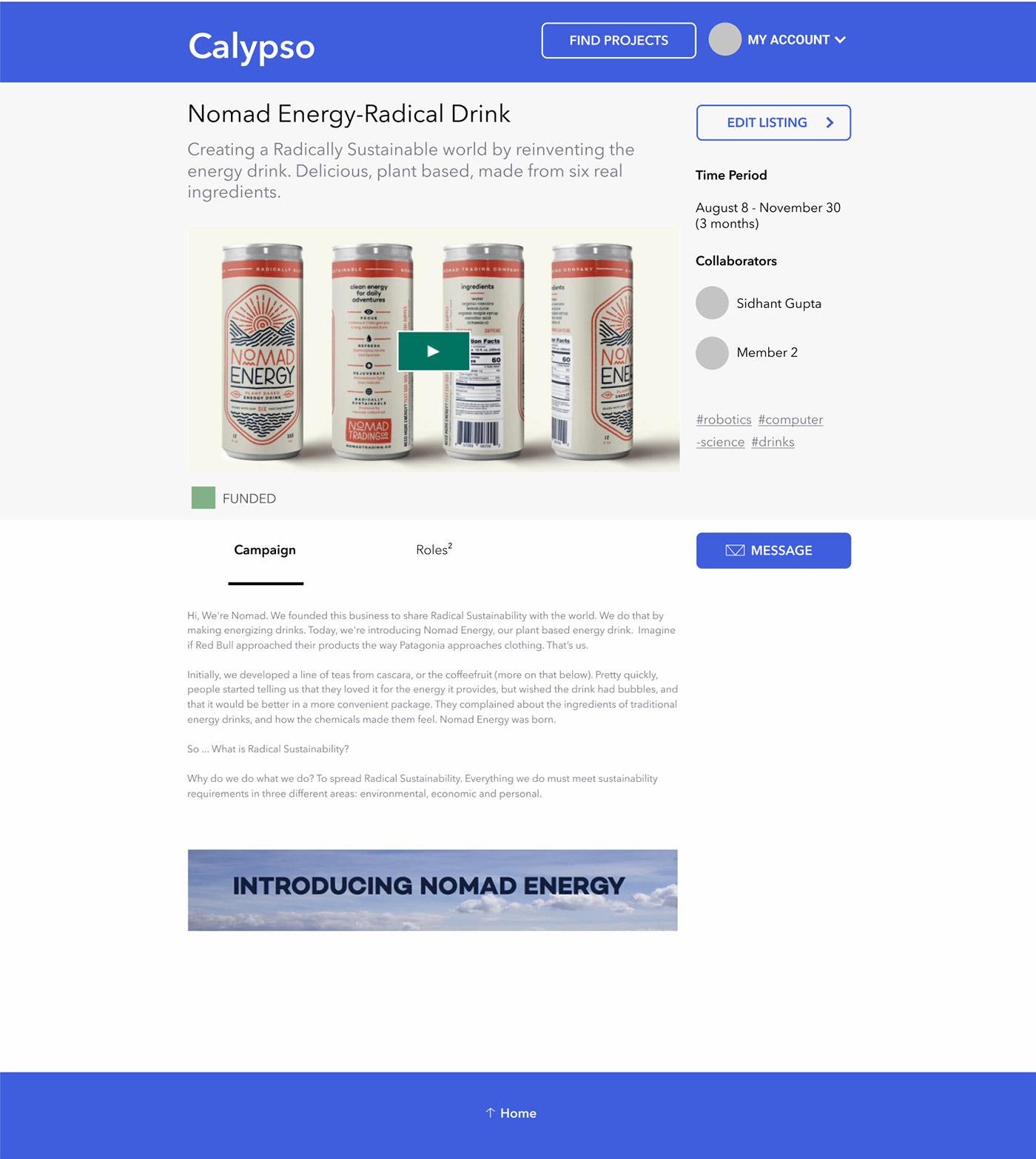
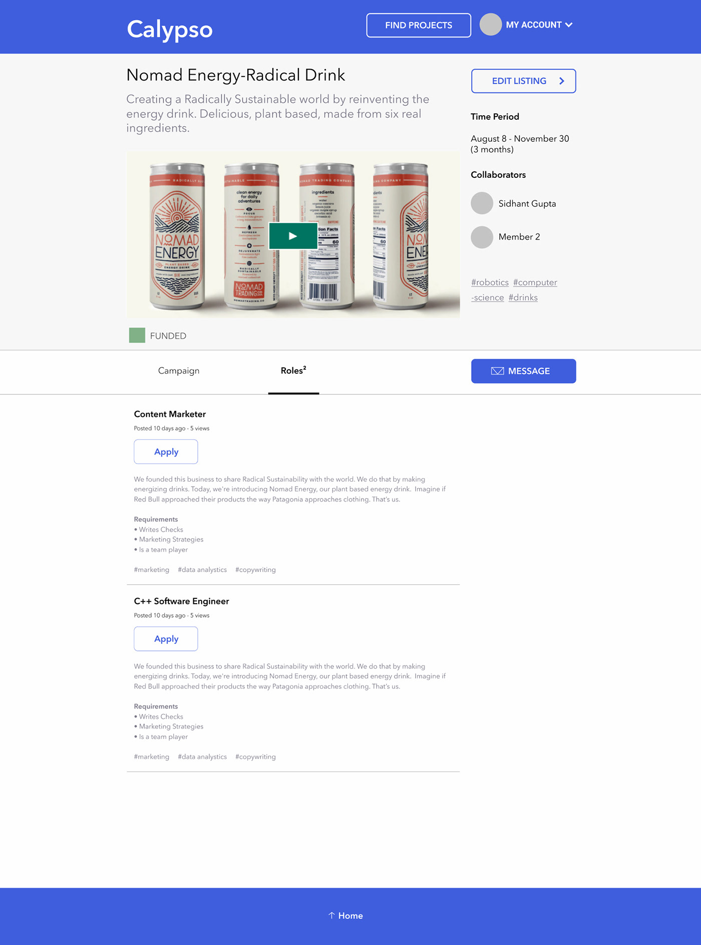
Project Page
An edit button was placed to simultaneously shift between editing and publishing modes.
Campaign
Roles
Applications
Applying
Application List
Edit Profile
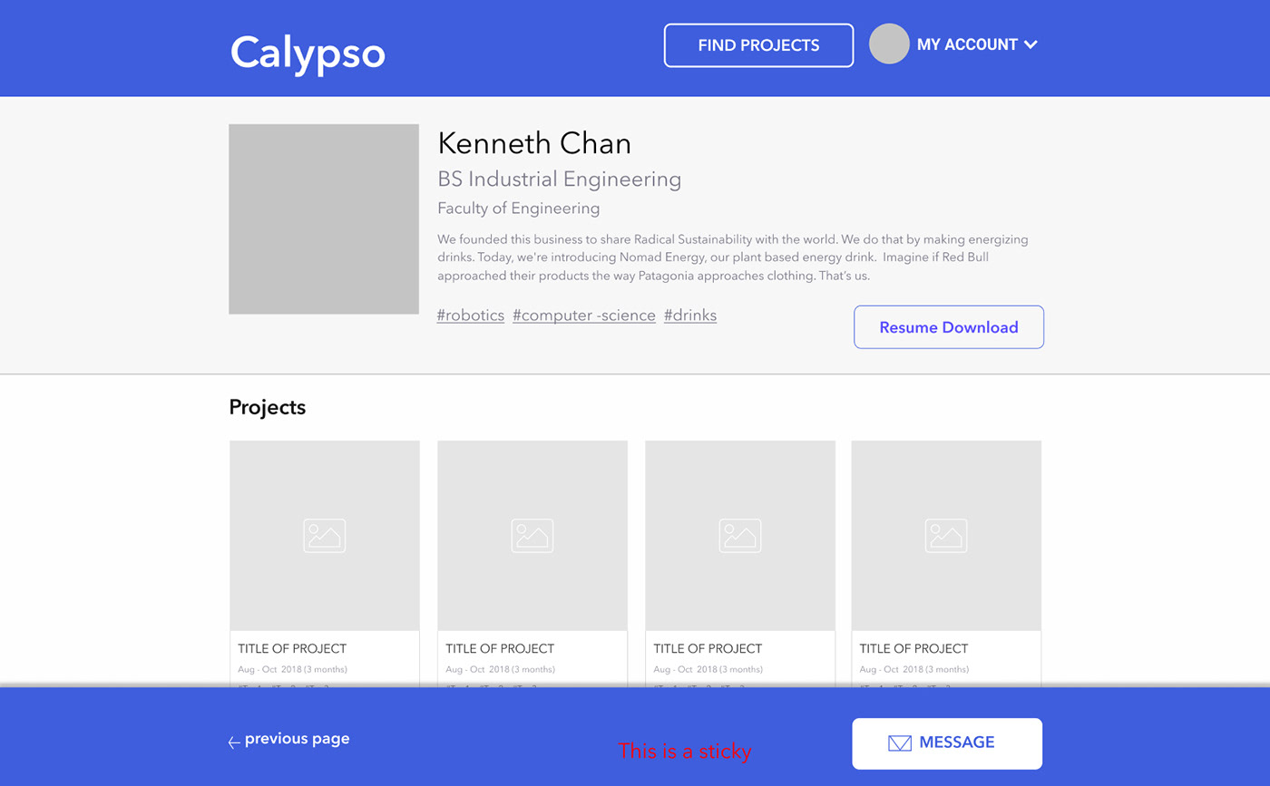
Sticky footers were placed at the bottom to make it easier to navigate on mobile devices (specially iOS with no back button) and optimise site for future app development.
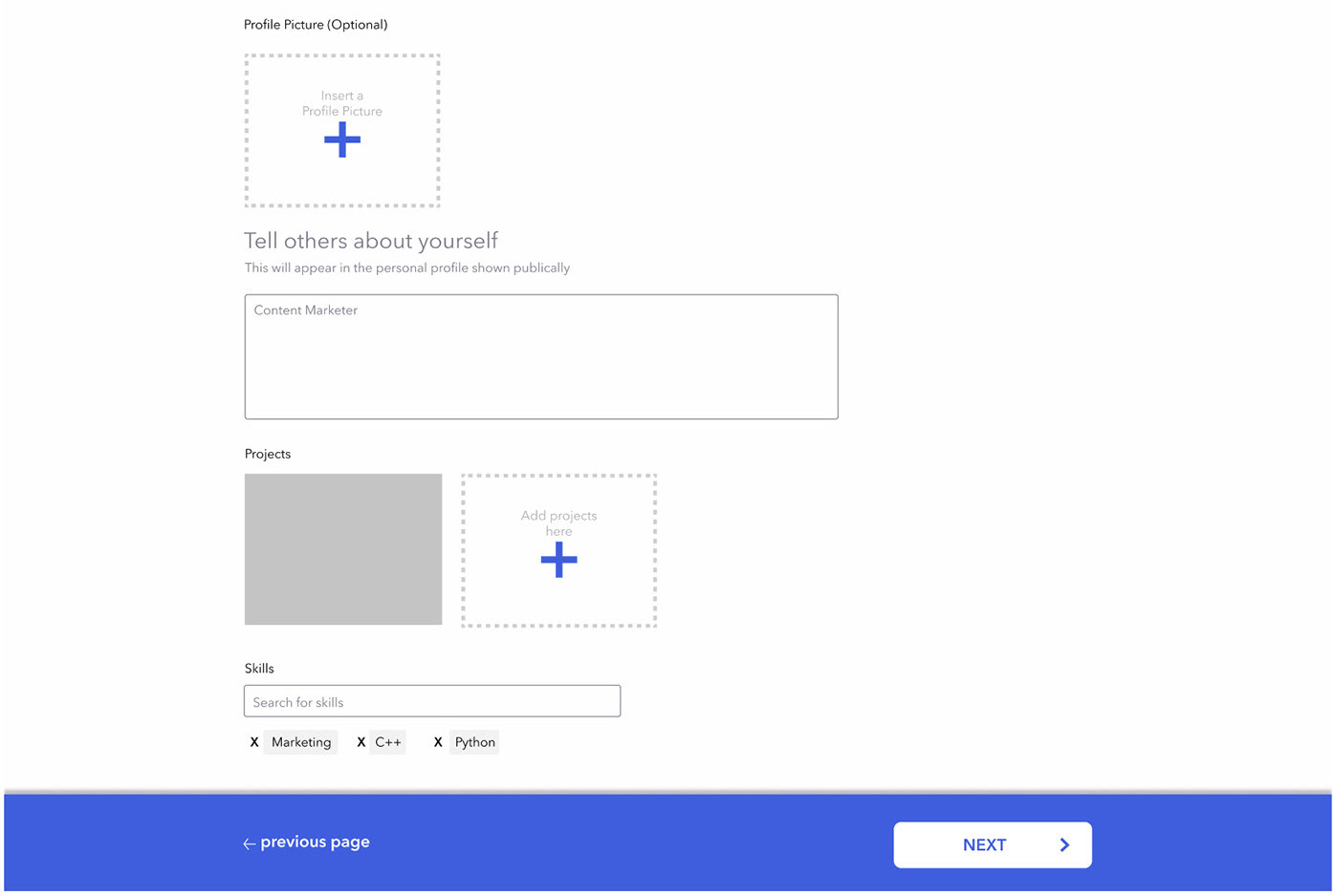
View Profile
My Projects
